August 18, 2011

✥ UPrinting.com Giveaway ✥

You guys have been so awesome! I couldn't ask for better readers!
You follow my little blog, you make me feel amazing from all your positive feedback, and you do it all without a single free item! How can I thank you? 
How about a giveaway?!
I guess UPrinting has heard how much you all ROCK, cause they want to give 1 person a letterhead package!
Have you guys checked out their products?
They have awesome personal or business supplies that are completely customizable. 

Here's a few of their great products to get you started...

 
All right, here's the DETAILS.

UPrinting wants to offer 1 (one) person the chance to win a: 
500 piece Letterhead Package
5.5' x 8.5'
70 lbs Offset
Font Only Printing
4 Business Days Print Turnaround Time
*Free Shipping

 {Here's HOW TO ENTER}

Please leave an email address with each entry, cause you want me to contact you, right?
Please leave a separate comment for each entry.

Mandatory
☛You have to be a follower {but you want to anyway, right? ; D  }

Extra Entries
☛Visit UPrinting.com, then come back and tell me how you'd design your new letterhead!

☛Spread the good news about the giveaway. Tweet, Facebook or blog about it and get an entry for each one! Just come back and leave me a comment with your FB, link, or Tweet.

☛Like UPrinting here on Facebook, then leave me a comment to let me know.

That's 5 chances to win!
Winner will be announced Tuesday, August 23rd!
{Winner has 3 days to contact me after they're announced.}

Restrictions: -Limited to *US residents 18 years old and above only -
You are  ineligible to win if you have won a giveaway from UPrinting.com in the last 6 months {sorry}
Disclaimer: This giveaway is sponsored by UPrinting, no monetary compensation was given for hosting. 
Letterhead design inspiration and envelope printing is also available. Please visit UPrinting.com for more details.

August 13, 2011

✥ Z Gallerie Subway Art Knock Off ✥


I've been longing for some subway art for awhile. I didn't want to do a stencil or paint project because I wanted it to look legit! I wanted to basically have this Z Gallerie piece that costs hundreds, but of course I'd like to pay umm, nothing 40 bucks.

One day I came across this tutorial from A Thoughtful Place. Courtney has done a smart remake for this well loved project. She uses Microsoft Publisher to create a template which she has made into a poster and then attaches it to a canvas.

I thought to myself, self, you can do that.
So I did. I have a Mac and don't have Microsoft Publisher, but if you have Word 08 you don't need it- your program has two uses, one of which is the publishing layout view.
I found it to be just as easy as the regular word program.

First, you want to format your text box into the same dimensions as your canvas will be. For example, if your canvas has a of width 3 ft and a height of 5 ft you want you text box to be in a 3/5 ratio.

Second, content, decide what you're writing on your canvas. Rather than copy Z Gallerie's canvas exactly, I choose to write the names of all the vacation spots that Z and I have LOVED. I want it to make us happy every time we look at it, especially because it will be across from the couch and next to the TV, prominently displayed you could say. 

Third, pick your fonts. For mine I used 4 fonts that I switched back and forth to create interest. I mostly picked fonts that had a typewriter/newspaper print feeling about them.
Fourth, layout, I tried to keep the overall visual flow the same as my inspiration-specifically the L.A. canvas. Z Gallerie has like 6 different posters and I found the spacing for this one to be the most visually pleasing, of course this is all personal preference. To adjust the spacing horizontally go into your tool box, then your "Fonts" and click on "W" to change it. To change the vertical spacing go into "Alignment and Spacing" and find "line spacing" to make the changes.

Fifth, matching the black background using shading effects. Before I finished I wanted to change the background to look more worn and varied. To do this, just click on the text box then go to your toolbox. Go to "Colors, Weights, and Fills" and click on Colors, then hold down the arrow to see more options. There you'll find "Fill Effects", this is where the good stuff happens. In "Gradient" you have several options to blend two colors. The variant I chose was "Diagonal Down", for "Colors" I picked two shades of grey, and for "Transparency" I put in between 0 and 20%.

OK, you're done with your poster!
I had my poster printed up at Staples and it cost $3.40. Staples was a lot cheaper than all the other places, and yes, I called everywhere.  This size poster would've cost 64 dollars if it was done in color! Crazy, right? So, you want to do black and white- which allows for grey tones as well.You may want to print it up a little larger than the canvas dimensions, so it will be able to wrap around the edges, too.

I purchased the canvas at Michael's. I planned on using a coupon, but they were on sale for 50% off. So I splurged on the  more expensive, thicker and higher quality canvas instead. I'm super happy that I did that, as it make a huge difference. It make the piece look much more expensive and substantial. My inspiration piece was 30 x 60. The canvas I purchased is 30 x 40. That's the closest I could get with the pre-made sizes.
Sixth, adhere your poster to the canvas with Mod Podge. It's easiest to begin with the poster rolled up. I painted decoupage on the canvas in 6-8 inch high sections across the entire width of the canvas. Then laid out the poster on the painted portion so that I could unroll it after I painted each section You'll get a lot of wrinkles and for this look you want them. I adhered the top first, then the sides. 
If you rub the Mod Podge when it's wet the black ink will smear over the white print. You can see the difference between where I rubbed the A and where I hadn't yet. If you want the distressed look you'll want to do this in several places, if you don't then be careful!
Seventh, distressing  to match the worn look of the inspiration piece. I worked with three different grits of sandpaper, a Dremel with a sanding bit (optional, but very helpful), and a level for a straight edge. I distressed the edges of the canvas, the tops of the wrinkles I mentioned that we wanted, and I highly distressed the two corners that were lighter gray vs the two that were darker {due to the "diagonal down" lighting gradient I chose}. Lastly, I used my straight edge so that I could create the look of worn lines using the Dremel and sandpaper.

Eighth, matching the distressed lettering using paint. I used craft paint to create the dark spots over the white lettering. I mixed white and black paint so I could match the varied background in the different poster portions exactly. 
I used a sponge brush and several techniques to match Z Gallerie's look, including tapping the brush, blotting it, and dragging it in different directions.

Ninth-Seal up your work cause you did it! Use whatever type of sealer you like, except Mod Podge! ;)  I thought I could just Mod Podge over the poster one last time to seal the sanded edges- obviously this was more action and impatience and less forethought and planning. A lot of the paint I had just applied came off. 


Do I ever get a project right the first time, come on!
So use whatever spray sealer you want, just make sure it works with paper and will not yellow over time.
All in all, I paid $35.50 for this knock off {well actually, 23.50. I made 10 bucks off of the poster because Staples first printed the wrong size, causing me to have to return to the store and then wait for 45 minutes for the right one to be printed off.} Even without that I would've saved 365 dollars!
Now go make some subway art and save yourselves some dinero!


Update: Please check out these lovely sites who've featured my Knock Off! {yay!}
Cherished Treasures”=
The Shabby Nest


August 11, 2011

Create & Personalize Blog Favicon [Tutorial]-Lose that Orange B


You know when you're online, the icon to the left of your web address?


Well, that is called a favicon and if you blog on Blogger is looks like an orange "B" and on Wordpress it's a black "W".
While you're reading my post right now, you'll see a little house and a "G 2 B" on it.


So there's a FREE way to make your own. You guys know how I love to make my own blogging accessories, cause I'm kinda cheap frugal like that!
You just head over to Favicon and sign up for a free account.
{You have to sign up, or else you can't copy and save your creation- which is annoying since you have to start over, not that I know from experience!}
Once your account is created you can design your favicon however you'd like. Something that signifies your blog theme of blog name is probably a good idea.

There's two ways {that I know of} to add a favicon to a blog.
The 1st Way
Once you've decided you like the icon, you can look at "Preview" and underneath it click to "download" it.
Next go into your Dashboard and click on "Design."
Right under "Add and Arrange Page Elements" you'll see "Favicon" go ahead and click on "edit." You want to add the saved file here. Save the addition and preview it. If anything's wrong you can delete the text out and start over, no worries.
Once you've saved your changes you should be good to go.


 This 2nd Way is a little harder- but it's the way I learned first so I'm sure you can do it too.

Once you've decided you like the icon, you can look at "Preview" and underneath it click to 
"publish under an open license."
You will be prompted to title it, then you'll get directed to a new page that will hold all the icons you make.
Click on the title of your favicon and you'll get a page with the ability to download you icon or copy its code.
There are directions with the code for where to insert the icon's html code. But basically it tells you to go into your Dashboard and click on "Design."
Right under the page tabs you'll see "edit html" go ahead and click on that.
(People say you should copy your whole page before touching it, creating a back up for yourself, since you WILL be inserting code there in just a minute.  But don't worry too much about inserting code into your page layout- you can preview the changes and "clear edits" so nothing to be too freaked out about.)
Now go back to the Favicon website and copy the second html code {the lower one} for your new icon.
Then insert the code in between and . For me it's about 2/3's of the way down the page. {You can just "control F" search for it.}  Then Preview it and if you like it, save your changes.

Good luck with this one guys, but it sounds harder than it is. It's just a little difficult to explain. Let me know if you all have questions!

 Update: I thought I'd add in the new updated version of my favicon to go with my new blog background!
Also- thank you all for letting me know when you've finished making your own! I LOVE getting to see what you guys come up with!

August 7, 2011

✥ Easy DIY "Eye Chart" Art ✥

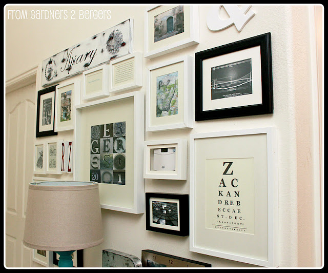
Do you guys remember when I shared my progress on my gallery wall?  I outlined my plan for completion and it included creating personalized art. One of the ideas I've had my eye on are these eye chart art pieces. I think they're funky and cool, but especially if they're custom.


There's a website called Eye Chart Maker {aptly named, right?} where you can input the words you choose and it will put them into eye chart format. So sweet, am I right?
This way we can nab someone else's idea on the cheap {only for personal use and giving them full credit, of course} or make a one of a kind piece- like I've done.


You can play around with the program, creating rough drafts as quickly as you can write a sentence. There are a few limitations to what you're able to create. You are bound to a certain numbers of letters and lines, providing limited flexibility. This calls for some creativity- but it's a fun challenge. 

These are a few of the 20+ options I came up with. It took me some time to play around with the letter restrictions and line restrictions. Apparently I'm wordy or something?

In the end I uploaded my draft to Picnik so I could add another line, or two, of text.
Here's my final result.
This project was a lot of fun to do. It's a super easy way to get that eye chart look!

 
I hope you guys will make your own, cause I can't wait to see what you come up with!
 

August 4, 2011

Tutorial: Add Social Media Icon [RSS} into Your Blog

I've explained that most buttons are easy to make- but your email icon and RSS work require an extra step. We made the email icon and added that- now you wanna make the RSS link?
 

[1] Decide on an image what you want to use to represent the link on your blog. There are several sites, like Design Matterz, that allow you to use images for free and this one has a great selection of colors.
[2] Once you've decided on the image, upload it to a photo hosting site, like PhotoBucket. This is important because we need an image code that we will insert into our html code.

[3] Now you want to copy the grey code and insert your your feed URL{not the same as your blog URL} and your direct image code in place of the red portions.

[4] You are now ready to insert the code into the html portion of your blog post or (more likely) into your blog design.
To do this you should go to the "design" page, then click on "add a gadget." Next click on the gadget "HTML/Javascript." Here you can insert your entire code. By the way, you often see the buttons for email, Facebook, Pinterest and RSS all listed together. You can add the code into the same gadget, by listing one code after another.


Good luck making your own!